


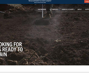
LIFT & SHIFT FOUNDATION
When I was approached by the Lift & Shift Foundation to redesign their website, I was very excited. The veteran run non-profit wanted to get a revamping of their website to turn it into something that meets their expanding business goals, increases user engagement and retention.

CHALLENGE
I was tasked with creating a modernized and robust new website that can keep their users attention when they're on the website as well as create an website environment that makes users feel comfortable and engaged.
Time
Client
Deliverables
6 weeks
Lift & Shift Foundation
High-Fidelity Desktop Mock-ups
Responsive Web Design
InVision Prototype
Style Guide and UI Kit
Design Presentation
BACKSTORY
The Lift and Shift Foundation is a veteran-run non-profit whose mission is to help veterans transitioning back to civilian life build self-confidence and their support network through exploring interests in science and technology.
• They are particularly targeting Army servicemen and women that served in non-tech roles who may feel unequipped and unprepared to rejoin the workforce.
• They want to remove barriers and provide encouragement for them to explore STEM fields that they thought were otherwise unattainable.
BUSINESS GOALS
Their website is intended to serve three target user types:

Goal 1: Restructure the site so that it clearly addresses each of three main user types: veterans, donors, and volunteers.
Goal 3: Automate and digitize more organization functions (e.g. event sign-ups, identity verification, monetary donation collection, etc.)
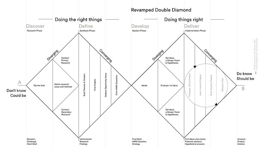
DESIGN PROCESS
My design process is insprired by IDEO’s double diamond approach of divergence and convergence. I found this to be a great user focused way of designing.
PROJECT JOURNEY


DISCOVER
PERSONA

To start off the "discover" process, I created a persona of a potential Lift & Shift user based on online research and my understanding of already registered users. This persona was created with assumptions of his motivations and frustrations (something that I tried to address through my future designs).
PRIORITIZING SCREENS
There were some lo-fi wireframes that were created with another UX team that were working with the client before I was added to the project. To start off, I knew that I had to discover which screens were the most important (so I can work on them first). In order to do this, I created a Priority Matrix.


The sign-up page, the homepage, and the donate page had the most impact for the company because those are the most used sections of the website by users. So I focused on making these first!
COMPETITIVE ANALYSIS
Lift & Shift can have a major advantage if the strength/weak points of the industry is known so I observed the color palette, imagery, typography and layout of its competitors (other non-profits that cater to helping veterans).
I saw what their strengths and weaknesses are with a goal to analyze my findings and discover any gaps in the market where the company can shine through!
Vettix

TeamRWB

Wounded Warrior Project

The Mission Continues
Fourblock

DEFINE
PAIN POINT 1
Lack of variety! Some competitors seem to serve veterans only through physical activity. Their site feature fun runs, fundraising runs etc. While they are playing to their strengths (they only offer physical activities for veterans to participate in) they are actually narrowing their user base. Some veterans either don't want to or can't participate.

PAIN POINT 2
A lot of the competitors use neutral tones to create a monotonous tone for their site. Gray tones and black/grey text which makes the site look static and could lead to less user engagement. The company's tone/brand isn't matching what they provide. They offer great beneficial services for veterans but their site colors make it very incongruous with their message.

PAIN POINT 3
There was a clear lack of color and navigational hierarchy within some of the competitors sites. There was a swatch of color that was too similar to the text color on top so the text visibility was lowered (i.e. light blue text on dark blue background). There were misalignments with text and imagery that really took away from the quality of the site.

STRENGTH POINT 1
Certain competitors are using a variety of colors, infographics and images to really liven up their site and create a sense of "happening". It looks exciting and inviting.
IDEATE
STYLE TILES
Knowing the aesthetic and UX pain points of our competitors, it was time for me to create some visuals that can solve those pain points!
I took design inspiration from various sources like articles, Pinterest, certain images, art magazines etc. this gives me a wide range of color choices, visual aesthetics, typography and even button choices to take direction from when I create my own aesthetic for the website. It always helps to have a rich library of visual aesthetics to choose from when creating something new and modern and robust.


DESIGN PRINCIPLES

Everyone should be able to explore the site and understand the elements on each page. We are building this site for people of all degrees of internet experience and we have to keep that in mind when designing.

Create a design that is it’s own and completely different from all competitors; direct and indirect. We want to build the Lift and Shift brand to be entirely it’s own and differeniate it from its competitors.

To create a design that is easy and clear to understand. Each design feature should add value and have a purpose.
DEVELOP
WIREFRAME PROGRESSIONS
Home Screen
Iteration 1
Iteration 2
Iteration 3


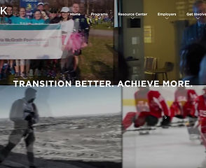
Taking guidance from the style tiles, I created this first rendition of the homepage. I used circular modals to convey the value add for the customer. The color palette was picked to be patriotic to go with the theme of helping veterans. I wanted veterans to feel patriotism emanating from the home page.
Our client really wanted to use company provided images because it properly convey the tone of the organization. That's why I used all the pictures shown here. I emphasized the battle of the bots and I also emphasized meeting in groups because those were really key values that the organization offers to veterans.
Taking user feedback, I changed the imagery to be more veteran focused. The color scheme stayed red white and blue while the images changed to be more of veterans.

User Testing
User Testing
The text has been changed after conducting AB testing with veterans and really understanding the language they used to feel included and felt appropriate for the site.
Improving on my imagery choice, I used more pictures from the company databased that was provided. I also wanted to pick images that weren’t red, white or blue so that it adds a nice color variety to the screen.
100% of users wanted to see more personalization on the site as well as providing veteran centered images throughout the site.

“Change the 3 circles in the home page to be more personal.”
“Include a video of the battle of the bots in the home page.”

The effectiveness of the copy text wasn’t evident to all of our users. They stated that this didn't convey what the site was about.
“It [the text from the home page] feels vague and confusing.”
Join Page
Iteration 1


"The memorial flag image in the veterans box symbolizes deceased military so it is not appropriate for this."


User Testing
Aside from using the images provided by the client, I also found a image on Google of a robot that I then edited using Photoshop and illustrator to disassemble. Now as the user input their information in the field, the robot would be built. This represented the battle of the bots which was a robot building exercise hosted by the organization. I included this join process with the robot because it was a great way to build brand identity, but the robot was so generic that most users weren't able to connect the robot to the events that company hosted. The robots that Lift & Shift built look completely different.
Iteration 2


"I love the new images!"
"The robot that's being built is the same as the robot in the home page. That's awesome!"

In my research, I was able to find a robot that was the exact animated copy of the real robot that's built in the battle of the bots. I disassembled this robot on Photoshop and then use this instead of the old robot so that it adds another level of personalization not only for the user but also for the company.
Donate Page

For the donate page, I kept it very true to the wireframes. I wanted to make sure that the important functional aspects of the donate page was being conveyed. I made sure to create different tabs so that donations can go to specific events. I also gave the user ability to pick how much they want to donate by choosing the other amount button.
An idea that I want to further develop was more interaction between donors and the website. I included a list of all the donors at the bottom of the page but I felt that it could be improved.
"There could be a ‘thank you for your contributions’ text after donating. Have an individual photo for each donor."
“Include a microinteraction that shows the donor’s name being added to the donor list after they donated money. Show the user's name and photo in the donor list. Include more information in the join today page after the user picks veteran or supporter. “
Affinity Diagrams
While we went through multiple rounds of user testing, I collated all the user feedback we received into affinity diagrams, tracking what users said about each aspect of the screens to tease out some patterns that emerge.
Round 1 Affinity Diagram

While the users had a lot to say about each of the categories I picked out, the overarching theme was a push for more personalization through the use of imagery and appropriate copy text for the home page. The users had a need to feel included as patrons of the site and they felt that using said imagery accomplished that for them.
Round 2 Affinity Diagram
This round of user testing yielded a more nuanced result. The program was almost finished and users felt that the navigation/ease of use was great for the app. They really responded to it positively and felt that it was really easy to use.
They also loved the changes I made to add more personalization to the program. Not only did the imagery accomplish to show the real tone of the company, the use of the animated robot also was well received by the users.

DELIVER
FINAL PROTOTYPE
MICROINTERACTIONS
Because the join page was so important to the organization, I was able to use micro interactions to further animate the robot that was being assembled when the user puts in their information in the text input fields. My entire thought process behind this was to create another layer of participation and personalization for the site.
NEXT STEPS
After multiple rounds of user testing the final prototype, we largely received a positive response. Not only did the stakeholders like the designs, the users also found them to be very functional and easy to use. One thing that users wanted to change was the copy text. I created this text as a placeholder and it will be up to future designers to create a better fitting text.

LESSONS LEARNED
My main challenge was building a prototype that adhered to the laws of gestalt while also taking inspiration from the style tiles. Making sure everything was on a grid, and every text and image followed the same treatment was tough to do at times.
Next time I would make sure my button designs, my text designs, my color choices and my images are picked out before I actually build the prototype. This way I can avoid changing things to fit the needs of every page.
Another insight I gained from this sprint was that when presenting to a client, make sure you know what you are talking about in terms of your own designs, admit when you feel that certain parts of your design needs to be improved and to also have plans to improve said designs so that the client sees that you can recognize where something is lacking and are proactive enough to figure it out.
It was also quite hard to interview people properly and still finish my designs on time. I was able to do this by asking my teammates for help when i needed it and I also sectioned time off for myself so i wasn't working too hard and burning myself out.
DESIGN SYSTEM
OTHER PROJECTS


